
Palettes, Gradients and Mockups — Design Without Design Software
Pick colors that work together, generate CSS you can paste, and mock up ideas — design fundamentals for people whose job title isn't "designer."
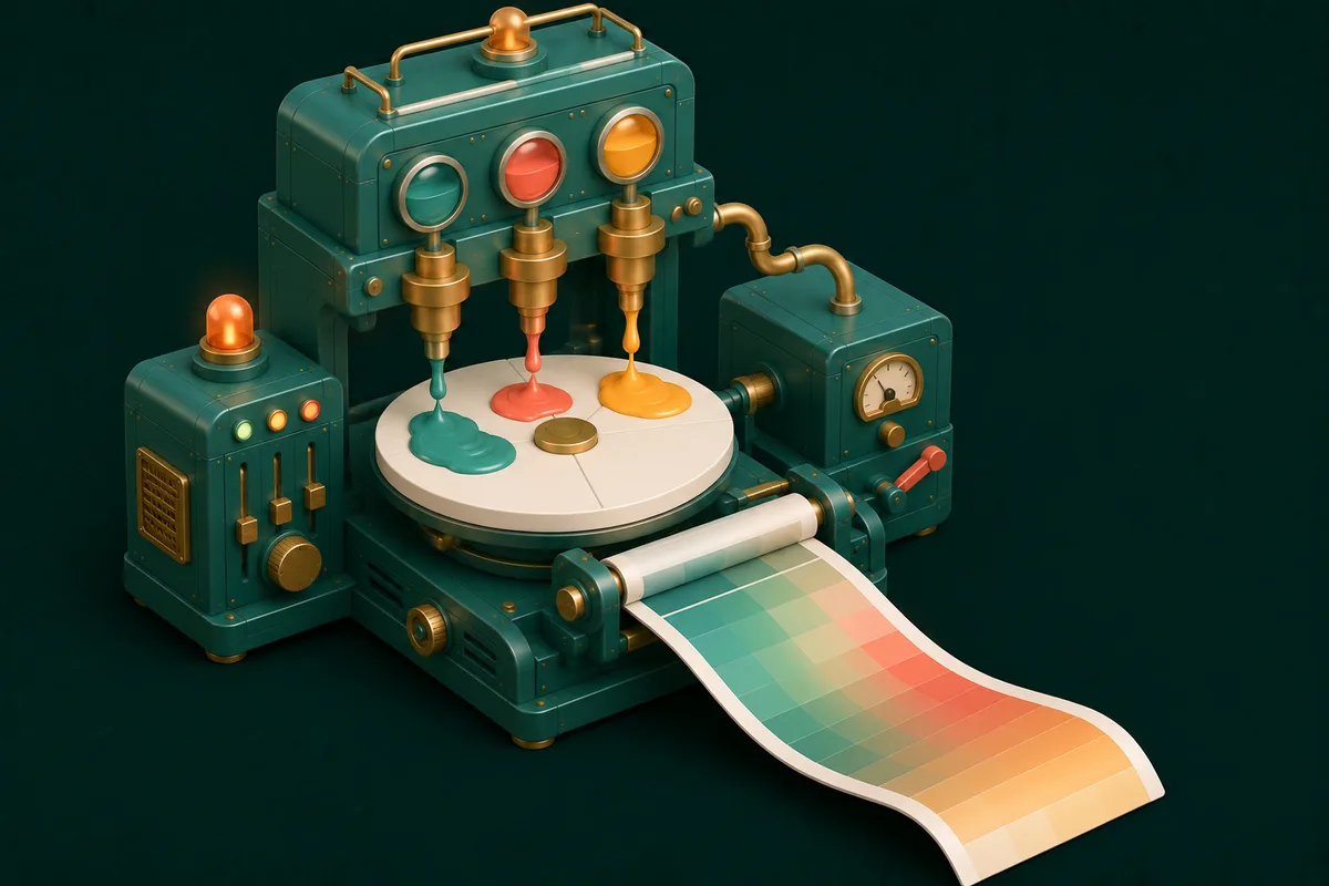
At some point every project needs to look like something: the side-project landing page, the presentation for Thursday, the small business's first brochure. And at exactly that point, non-designers face a menu of bad options — install a professional suite for one palette decision, subscribe to a design platform, or wing it with colours that fight each other in public.
There's a fourth option: the handful of decisions that make things look composed are supported by small, single-purpose tools that run in a tab.
Colors: the decision that makes or breaks everything
Most "this looks off" problems are colour problems, and most colour problems come from picking hues independently instead of as a system. Color Palette Generator builds harmonious sets from colour theory (complementary, analogous, triadic) — lock the one colour you're sure about and regenerate around it until the set clicks.
Two shortcuts worth knowing:
- Steal from a photo you love. Color Palette from Image extracts the palette from any picture — a sunset, a brand you admire, last year's poster that worked. Photographic palettes are pre-harmonized by reality.
- Go deeper when it's a brand. Advanced Color Palette produces the full tint/shade scales real projects need (the light background version, the dark text version — not just one hex per colour).
Translate between formats as tools demand them with Color Converter, and check text-on-background readability with Color Contrast Checker — the accessibility step that separates professional from merely pretty.
CSS effects: generated, not memorized
Nobody hand-writes gradient or shadow syntax from memory — designers use generators and paste. Now so do you:
- Gradient Generator — pick two or three palette colours, adjust the angle, copy the CSS. Subtle same-hue gradients (light teal → slightly darker teal) read as polish; rainbow gradients read as 2016.
- Box Shadow Generator — the difference between a flat rectangle and a card that floats is one well-tuned shadow: large blur, low opacity, slight vertical offset. The generator's live preview finds it in seconds.
- Border Radius Generator — consistent corner rounding across a page is one of those coherence details nobody names but everyone perceives.
Structure before decoration
The counterintuitive pro habit: decide layout before touching colour. Wireframe Tool sketches boxes-and-placement without visual temptation — where the heading sits, what the eye hits first. And when the project involves a "vibe" discussion with anyone else, Mood Board Maker collects references into one shareable canvas; agreeing on a board beats debating adjectives.
For finished assets sized to their destinations — social posts, thumbnails, banners — the Social Media presets already know every platform's dimensions, and Image Resize handles everything else.
Frequently Asked Questions
How many colors should my palette have?
The classic recipe: one dominant colour, one accent used sparingly, plus neutrals (near-whites/greys/near-blacks). The 60-30-10 proportion rule survives because it works — most amateur pages fail by giving three colours equal billing.
Can I use these for commercial projects?
Yes — colours and generated CSS aren't licensed assets; palettes and code you generate are yours to ship.
Why do my colors look different from the preview when printed?
Screens (RGB light) and print (CMYK ink) render colour differently — bright screen colours mute on paper. For anything printed professionally, ask the print shop for a proof.
Do these tools work offline?
Yes — like the rest of AnyTool, they run in your browser and keep working without a connection. Palette experiments on a flight are a legitimate pastime.
Next thing that needs to look composed: start with the palette at Color Palette Generator, let structure and effects follow — the full studio bench is at Design Tools.